The Competition. Trailer from OFFICE FOR STRATEGIC SPACES/ OSS on Vimeo.
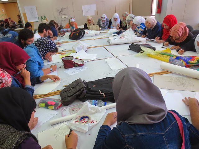
JUST 3rd Year Architecture Studio
Monday, November 10, 2014
Wednesday, November 5, 2014
Deborah Berke: Inspiration, Drawing, and the future of architecture
Deborah Berke, Deborah Berke & Partners Architects from ARCHITECT Magazine on Vimeo.
Also check out her video on Architecture & Austerity
http://www.dberke.com/av/nbm03.htm
Saturday, October 25, 2014
In-studio Charrette
Students were given a series of quick warm up exercises to help them think creatively and abstractly. The last exercise was 1 hour to revise their models. Quick sketch problems like these can help designers get “un-stuck” when they have trouble figuring out what to do next.
Some examples of sketch problems include:
Sketch as many instances of repetition as you can find How many ways can you draw a path without using a line?
Draw the rhythm of the path(s)
Express as many instances showing the relationship between repetitive elements to the unique
Show all additive (subtractive) elements
What is the underlying geometry of the space?
Show spaces or elements which show a progression
Diagram the symmetry or balance in plan, elevation, and massing
Illustrate the effects of light and shadow on the space
Explain how the unit relates to the whole

The Curse of the Great Idea
Sometimes, having a great idea at the beginning of a project can be a curse because it’s easy to get stuck in the sheer wonder of the idea and fail to think critically about it. The project below is a great example of this. The initial idea of using a sequence of slits in a material to create of series of light and shadow effects on the great was stunning. Additionally, it supports a significant campus experience of the play of light and shadow in the corridors and along the edges of the courtyards. Unfortunately, this project never evolved from this point. It continued to be a series of sliced planes with light behind them. There was no development of spatial qualities nor did the model reflect any actual place on campus. Similarly, the diagrams which accompanied this program were linear and placeless.
 |
| The first model created some very interesting effects on the ground plane. |
 |
| Unfortunately, the model failed to evolve into anything more - neither spatial nor grounded to an actual place. |
Friday, October 24, 2014
Introduction to Wayfinding Studio Project
Design Project
Wayfinding at Jordanian University of
Science and Technology
.
Tools for reflection about 3rd Year Design Studio
at JUST
.
Project
Wayfinging at JUST
.
The Jordanian University of Science and Technology designed
by Kenzo Tange, 1986 represents a high point of modern architecture with its
rational master plan which responds to environmental issues such as sun, shade,
natural lighting, and dust storms. Tange
arranged the linear buildings around square courtyards rotated 45 degrees from
the cardinal directions. Entrances to each building, passageways to the
courtyards, and vertical circulation all occur at the intersections of the
buildings. The overall effect is an elegant plaid pattern on the landscape.
Unfortunately, the ground this plan becomes disorienting because of its
repetitive nature. The lack of architectural hierarchy makes it difficult to
understand one’s location in the campus. Even though each façade is articulated
differently and the courtyards vary in depth, vegetation, landscape
articulation, and pools, the use of a modular system based on 30cm module and
the consistent use of concrete and glass reinforce the interchangeability of
spaces. Further disorientation occurs at the intersection/entrance nodes. One
could expect hallways to continue through such intersections yet they are
offset so views ahead are cut off. Additionally, the stair towers are offset 90
degrees so that when exiting a stair, it is easy to find oneself traveling
perpendicular to the intended direction.
To combat this and develop a sense of identity, the
architecture department painted its internal walls blue. Such a simple move
dramatically improves the findability of the department within the campus, yet
does nothing to improve general wayfinding.
.
.
The challenge of this studio project is to develop an
architectural solution to the problems of wayfinding at JUST. The course will
begin with several abstract assignments to help students understand concepts of
wayfinding, analyze the campus, and develop innovative solutions.
.
.
The objectives of this course include:
- To understand the difference between architectural intention and actual use of buildings
- To navigate between conception and pragmatic ideas
- To develop the student’s analytical, conceptual and technical design tools and their integration
- To enhance the students sensibility to the experiential aspects of design. It’s object will be the human body, its sensory experience and transformations; through touch of different textures, smell, movement, transitions from light and shadow
- To help students focus on experiential and spatial concepts rather than formal aspects of design
 |
|
View of campus from Southeast. The double towers are the
corner entrances from the main plaza street.
|
 |
| Instructors: Laith M. Obeidat, Sana' A. M. Al-Rqaibat, Amal T. Almalkawi, Yasir M. Sakr, Marika Snider (not pictured: Amneh H. Al-Zoubi) |
 |
|
Tower entrance with view to interior courtyard
|
 |
|
Courtyard with different façade articulation on each
direction
|
 |
|
Courtyard with different façade articulation on each
direction
|
 |
|
Ineffective signage. I still don’t understand what
“Connector” means. There is no B11 building.
|
 |
|
Typical “node” on ground floor. Courtyard in center and two
wings on either side. The same condition exists behind the camera.
|
 |
|
Typical offset hallway which blocks the view of what’s up
ahead.
|
 |
|
Interior skylights which cut through all floors are
architecturally stunning but don’t help with wayfinding.
|
 |
|
Typical single-loaded
corridor @ courtyard
|
 |
| Single-loaded corridor @ administrative offices |
 |
| Single-loaded corridor with Blue Wall @ architecture offices |
 |
| Double-loaded
corridor |
Subscribe to:
Posts (Atom)


